


“Chair-ity Art”
By Hope Wallace
Artists have begun painting cast-off and Adirondack chairs in earnest for the upcoming “Chair-ity” Auction, June 3 and 4, during the ArtRageous on Main festival. The only rule is the chair must be functional so that people can sit on it. I can’t think of a better combination; a work of art you can use to either brighten a dark corner or to add a focal point to an outside living space and to totally surround yourself with beautiful art!
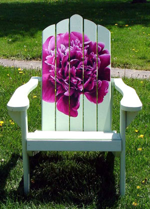
On this quiet Sunday morning the sun is coming out and with it the artist in me. I know, in the garage there is a “chair-canvas” and acrylic paints quietly waiting and persistently nudging me. I am trying my hand at a child’s chair and hope some interesting illustrations come out of my ideas. Some well-known area artists are painting chairs this year, including Doug Fiely, Laura Cramer, (famous for her mega-images of peonies) Linda McCann, Kay Sluterbeck and Pat Rayman. Pat has chosen a student desk chair and is off to an intriguing start. It will be fun to see the different art chairs developing!
Our 55th Annual June Show prospectus has been mailed to artists. There is still time to pick one up here at the art center, call us and we’ll mail you one — or you can download a pdf form from out website.
Time is running out to visit the Wassenberg Art Center and check out our current exhibits, “It’s In the Cards” and “The Art of Therapy” which focus on two very different types of art which both encourage interaction. These shows, sponsored by Vancrest Health Care Center, will run through May 7. Exhibit hours are 1-5 p.m. Tuesday through Sunday (closed Mondays) and admission is free.
The Wassenberg Art Center is located at 643 S. Washington Street in Van Wert, Ohio. Contact us by phone at 419.238.6837 or by e-mail at wassenberg@embarqmail.com. Check the calendar on our website, www.vanwert.com/wassenberg, for current activities.
Blacks, whites, depth and whales
By Kay Sluterbeck
Ever so often in this column we answer a few questions that have been asked of Wassenberg Art Center instructors.
Q. I’VE HEARD THAT IT’S NOT GOOD TO HAVE BLACK PAINT ON MY PALETTE, BUT I SHOULD INSTEAD MAKE BLACKS BY MIXING OTHER COLORS. WHY?
A. First of all, it’s perfectly all right to have black paint, or any other color, on your palette. However, people who aren’t sure how to mix colors sometimes use black to darken everything, which seems logical, but doing this can leave your painting with a flat, uninteresting look.
You can make lively blacks by mixing colors. Try Ultramarine Blue and Burnt Sienna. Another good mix for black is Alizarin Crimson and Winsor Green. You can adjust the amounts of each color to make your black mixture warmer or cooler.
Q. I WAS TOLD THAT IN WATERCOLOR I SHOULD USE THE WHITE OF THE PAPER AS MY WHITE. HOW DO I DO THIS?
Using the white of your paper, rather than white paint is up to you. One of the beauties of watercolor is that you CAN leave areas of blank paper as whites, and you can let white paper glow through transparent pigment. To save the white of your paper in watercolor, plan light areas before beginning to paint. Then use a masking agent to preserve them, or learn to leave them alone. If you aren’t comfortable with masking or painting around whites, there’s nothing wrong with using white acrylic or white gesso.
Q. HOW CAN I GET DEPTH IN MY LANDSCAPES, SO THINGS LOOK LIKE THEY ARE OFF IN THE DISTANCE?
A. A common problem for many people is that they want to paint every leaf on the tree, even if the tree is a half-mile away. When you are outside painting and you look at a tree in the distance, do you see details like bark and leaves? No, you only see the shape and color of the tree. Our minds tell us there are leaves on the tree, but we actually don’t see those leaves. Just tell your mind to get out of the way and paint what you see, not what you think you see. Colors should also be lighter and cooler the farther back you go. If you want to show depth, use warmer colors in the foreground with darker values (values = lights and darks) and more details, and use cooler, lighter colors in the distance with less detail.
Q. WHAT ARE THE RULES OF ART?
A. I’d like to answer this with a story from Catherine Anderson, a California workshop instructor and author, who says that before a class a student, Mary, handed her a small painting — a beautiful landscape of what looked like a little pond, like nothing she had done before. “Look what I did!” Mary said with pride. Catherine loved the painting and praised Mary on her wonderful job. Catherine thought the painting was finished, but it turned out that Mary didn’t think so.
“I wanted to ask your opinion on something,” said Mary. “”I was thinking about putting a whale in the middle of the pond. What do you think?”
Catherine was speechless. It took her a moment to respond. “God, help me come up with something!” she prayed. Then she thought about all the art she had seen in museums and galleries — at the Whitney Museum of American Art, the Guggenheim, the Metropolitan Museum of Art, etc. — everything from old mattresses hanging from the ceiling and wrapped in bungee cords to a hearse covered with tar that had all kinds of objects stuck to it.
“What is art all about, anyway?” she thought. At that moment she realized that there really are no rules. To criticize Mary’s idea would stop the creative process and keep Mary from expressing what she wanted to express. “Who am I to tell anyone what or how they should paint?” Catherine thought. She handed the painting back to Mary and said, “Mary, put the whale in!”
In art, there are no real rules or formulas. Instructors may make suggestions to guide you, but there are no laws. Anything goes. Put the whale in!
POSTED: 05/04/11 at 1:21 pm. FILED UNDER: What's Up at Wassenberg?